
Here's the frustrating part about landing page friction: most of it doesn't show up as a design flaw you can spot on inspection. The page looks fine. The headline isn't embarrassing. The button exists. And yet the traffic arrives, scrolls halfway down, and leaves. If you've been marketing on your own without a dedicated team, you've probably looked at a bounce rate and had no useful idea what to do with it. That's not a personal failing. It's a systems problem. The number tells you something broke, but not where or why.
The good news is that friction patterns are predictable once you know what you're looking for. They're not random. They cluster in a small number of places, triggered by a small number of causes. You don't need a conversion rate specialist or a full UX audit to start identifying them. You need to understand what your visitor was expecting when they arrived, and where your page stopped matching that expectation.
Friction Is Usually an Expectation Gap
When someone clicks a social post or an ad, they arrive with a mental model already formed. The image, caption, or headline they just read made an implicit promise. Your landing page has about three seconds to confirm that promise before their brain starts looking for an exit. Friction is almost always a gap between what they expected and what they found. The page isn't wrong. It's mismatched.
This is why redesigning your page rarely fixes the underlying problem. A new hero image or a different color palette doesn't close an expectation gap. What closes it is understanding what the visitor thought they were going to see, and then making sure the first section of your page delivers exactly that. The friction point isn't the design. It's the discontinuity between the traffic source and the opening message.
of visitors spend fewer than 15 seconds on a landing page before leaving.
Source: Microsoft Research / Chartbeat analysis of time-on-page behaviorThe Four Places Friction Actually Lives
You can save yourself a lot of guesswork by checking these four zones before you touch anything else on the page. They account for the majority of drop-off in most campaign landing pages, and each one has a distinct signature in your analytics.
- The hero section. If your scroll depth data shows most visitors aren't getting past the fold, the headline or subheadline isn't confirming their expectation fast enough. The fix is usually specificity, not creativity. Say exactly who this is for and what they get.
- The first body section. This is where visitors decide whether the page is actually for someone like them. Vague benefit language ('transform your business') doesn't hold them. Concrete, specific language about their situation does.
- The form or CTA. Ask for too much information too early and you'll see drop-off right at the moment of conversion. A long form above the fold, before you've built any trust, is one of the most reliable friction sources there is.
- The page's single job. A page that tries to do two things, capture leads and explain the product and showcase testimonials and offer a download, doesn't do any of them well. Visitors feel the ambiguity even if they can't name it.
Friction isn't what looks broken on the page. It's the moment your visitor's expectation and your message stop matching. And they quietly leave.
What Your Analytics Can and Can't Tell You
Scroll depth tools and heatmaps are useful, but they have a ceiling. They show you where people stopped. They don't tell you why. A visitor who scrolls 40% down and leaves could have hit confusing copy, a slow-loading image, a section that felt irrelevant, or a CTA that asked for too much. The behavior is identical. The cause is different. Treating them as the same problem and guessing at a fix is how pages get tweaked for months without meaningful improvement.
What's missing from pure analytics is audience context. The same page, sent to two different audience segments, will produce two different drop-off patterns for two different reasons. A first-time visitor researching their options drops off at the proof section because they don't trust you yet. A return visitor who already knows the category drops off at the hero because the page is over-explaining something they already understand. Analytics averages those two experiences into one number that doesn't accurately describe either one.
How to Start Diagnosing Without a Full Analytics Stack
If you're running campaigns without a dedicated marketing team, you probably don't have a conversion specialist or a full behavioral analytics setup. That's fine. You can do a meaningful friction audit with the tools you already have. Start by pulling your scroll depth data (Google Analytics 4 tracks this by default) and identifying the first point where more than 40% of visitors have dropped off. That's your first friction zone. Everything above that line needs to work harder; everything below it is secondary.
Next, read your page out loud from the perspective of the audience segment most likely to arrive from your top traffic source. If you're getting most of your traffic from an organic social post aimed at a specific type of customer, does your hero section speak directly to that person's situation within the first two sentences? If you have to scroll down to find the part of the page that matches the post, you've already found your biggest friction point. No tool required.
Quick audit: Open your landing page and your top-performing social post side by side. Write down the implied promise in the post. Then write down what your hero headline actually says. If those two things don't match. That gap is your first friction point to fix.
What Friction Diagnosis Looks Like Before a Page Goes Live
The smartest place to catch friction is before you publish, not after. Once a page is live and running traffic, every test costs you real visitors and real time. Running a behavioral simulation before launch, modeling what different audience segments will expect when they arrive, where they're likely to drop off, and what content they need to see before they'll act, means you're fixing expectation gaps in the brief stage, not in week three of a campaign that's already underperforming.
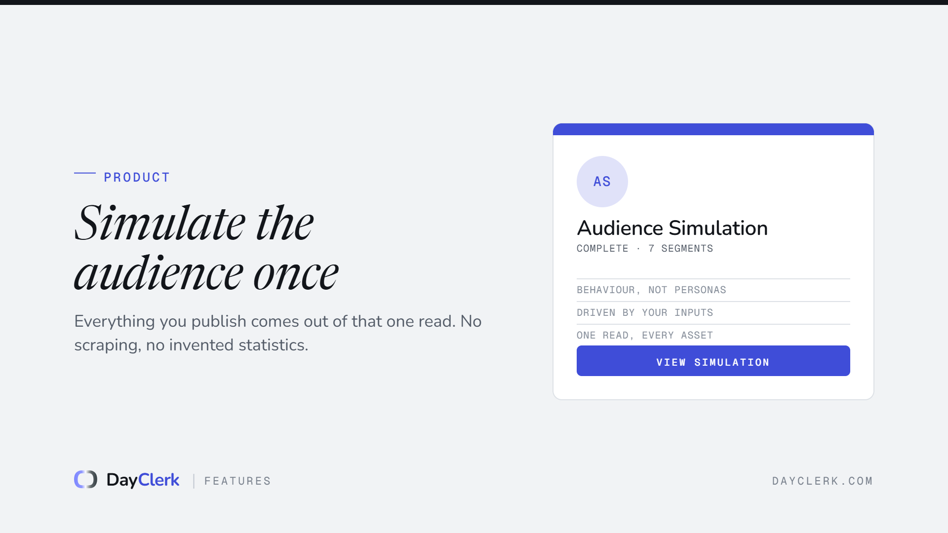
DayClerk's audience simulation does exactly this: before any page is built, it models behavior paths, friction points, content expectations, and drop-off risks for each segment. The output shapes the module order and copy tone of the page itself. It's not a guarantee of a perfect conversion rate. But it's a meaningful alternative to launching on gut instinct and diagnosing problems after the fact, which is the situation most self-run campaigns start from.
Whether or not you use a simulation tool, the discipline is the same: decide who the page is for before you write the first word, map what they expect to see at each section, and check your page against those expectations before you send traffic. Assumption-based marketing isn't a character flaw. It's what happens when there's no process forcing the question. Adding the question is the whole fix.