Some mascots are invented. This one was always there.
A face you already know
The DayClerk mascot is not a new character introduced alongside the product — it is the DayClerk monogram itself, brought to life. The D you have seen since the beginning contains a counter: the open negative space inside the curve of the letterform. That space has always been there, quietly holding the shape together. Now it holds a face.
The eyes live exactly where the negative space always was. Nothing was added to the logo — the character was found inside it. That decision matters because it means the mascot and the brand are not two things sitting next to each other. They are the same thing, seen from a slightly different angle.
Why a mascot at all
There is a difference between a product that presents information and a product that feels like someone is on the other side of it. DayClerk sits in moments that can be unfamiliar — first logins, decisions with consequences, prompts that ask something of you. In those moments, a face changes the register entirely.
A well-placed presence does not just signal warmth. It tells you that the situation is understood, that someone anticipated you might feel uncertain here, and that you are not alone with a form or a blank screen. A UI communicates. A face communicates that someone cares how the communication lands. That distinction is small in theory and significant in practice.
Products that help people through unfamiliar territory benefit from a presence, not just a UI. A face tells you someone is here — not just something.
The character behind the design
The word clerk carries a specific history. Before the era of automated everything, the day clerk was the person at the front of a business who held the whole experience together — not the most prominent figure in the room, but reliably the most useful one. They remembered your name before you gave it. They anticipated the question you were still forming. They handled the friction so you never had to feel it.
A great clerk understood what customers wanted before they said it out loud.
The mascot is designed to carry that same sensibility. It shows up when it is genuinely useful and steps back when it is not. It does not perform helpfulness — it practices it. And crucially, it never makes you feel like you are being processed, routed, or managed. The warmth is the point, not the decoration.
What it does not do
Clippy is the reference point no one forgets, for all the wrong reasons. Anxious, persistent, impossible to dismiss without a small act of will — it taught an entire generation to distrust in-product characters on sight. The DayClerk mascot is the deliberate opposite.
It does not wave for your attention. It does not celebrate every completed action as though you have done something remarkable. It does not fill silences with motion just to signal that it is still there. The character is steady. Its value comes from its restraint as much as its presence — you notice it when it appears because it does not appear constantly.
Restraint is part of the design. The mascot earns attention by not demanding it.
Where you will see it
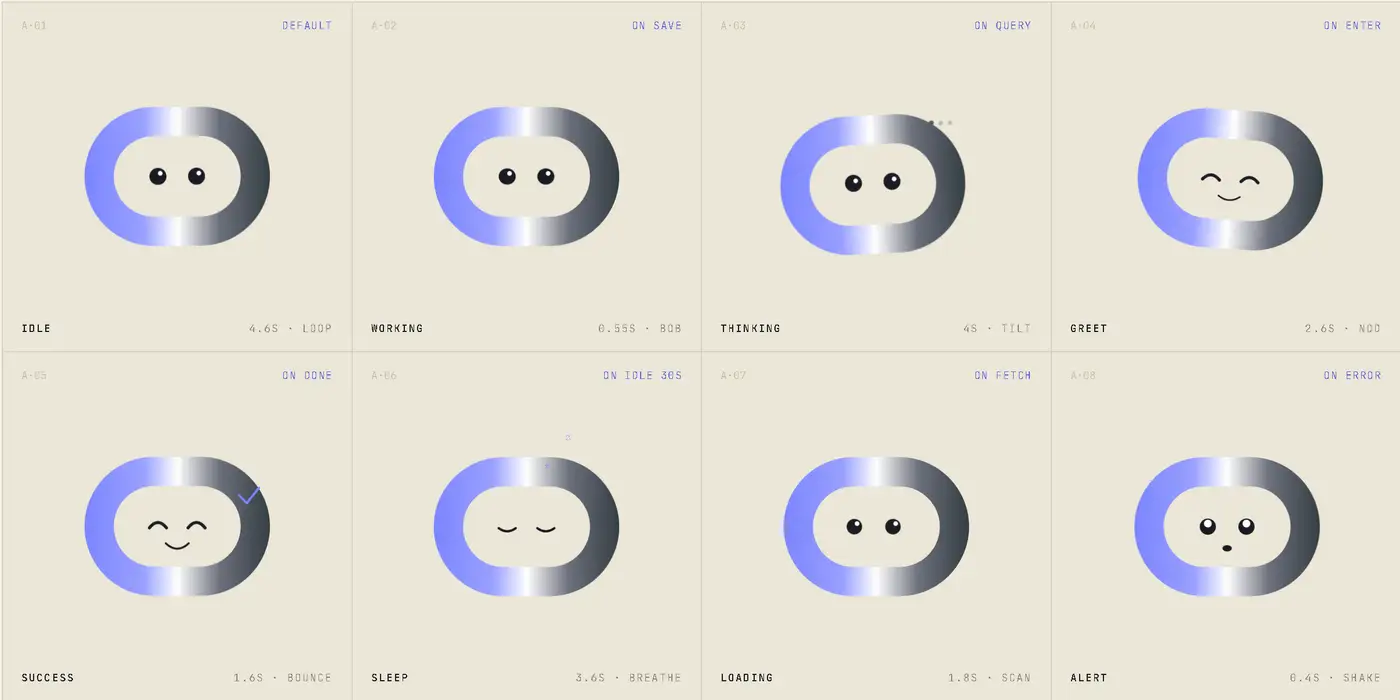
Every appearance of the mascot is deliberate. The surfaces where it shows up are exactly the surfaces where a person standing at a counter would naturally step in: onboarding screens, where you are finding your footing for the first time; the help center, where you have arrived with a specific need; feedback prompts, where a human tone makes honest responses more likely; empty states, where a blank canvas benefits from acknowledgement rather than silence; and loading moments, where a brief wait is easier with company.
These are not arbitrary placements. Each one maps to a moment of potential friction or uncertainty — the exact moments the original day clerk would have noticed and moved to smooth over without being asked.
You are in control
The mascot can be dismissed on any surface where it appears. If you prefer it off entirely, that setting lives in Profile → Preferences → Show mascot. The choice is yours, on your terms, at any point.
When the mascot steps away — whether dismissed for a moment or turned off for good — it bows. Briefly, without drama, unhurried. Then it fades out. It is a small thing, but it reflects something the design took seriously: the day clerk does not leave without acknowledging you. Disappearing without a word would be out of character.
To show or hide the mascot, go to Profile → Preferences → Show mascot.
The design decision that made it work
A lot of work went into the mascot. Expression states were tested, proportions were debated, contexts were mapped. But the decision that made everything else fall into place was a single, small one: the eyes in their resting state default to a slightly upward arc rather than a neutral circle.
That is it. An arc instead of a circle. The effect is that the face reads as warm by default — not excited, not performing, just open and at ease. A neutral circle reads as blank. A downward arc reads as tired or flat. The upward arc is the difference between a face that invites you and a face that merely exists. Once that choice was made, the rest of the personality followed naturally. The character did not need to be built — it only needed that one right decision, and it was already there.